About
This fake magazine is inspired by a campaign from the early 2000's from MuchMusic where they wanted to advertise ways to save energy which was to "flick off", but like this magazine's title, the finger is instead pointed to 'les flics'.
The title of the magazine is a slight double entendre for French and English speakers. On the surface, it reads Flick Flic for imply "Movie Police" because as we know all film critics are militant in nature for flaws. By adjusting the kerning in Flick, it can also read as "Fuck Flic"
Challenges
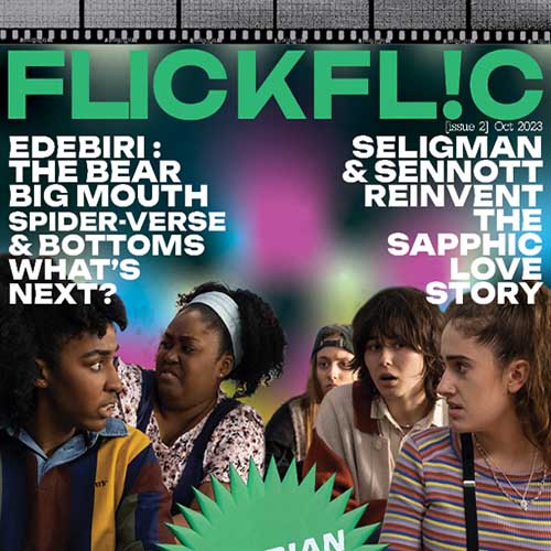
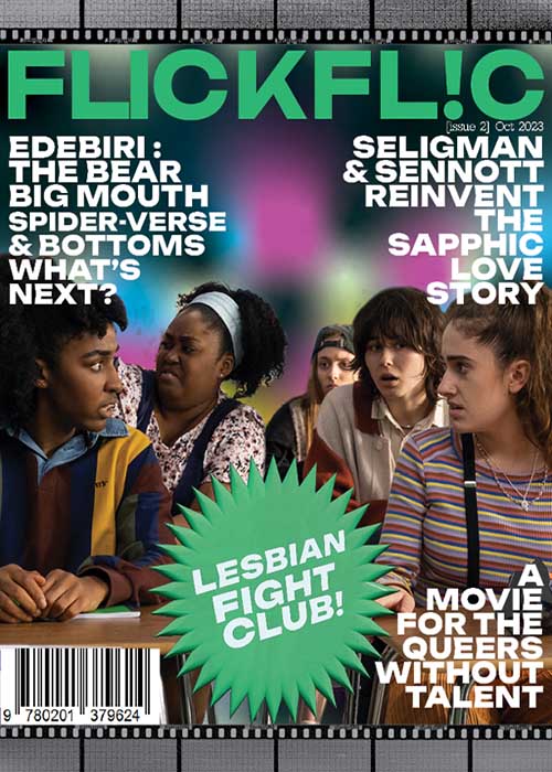
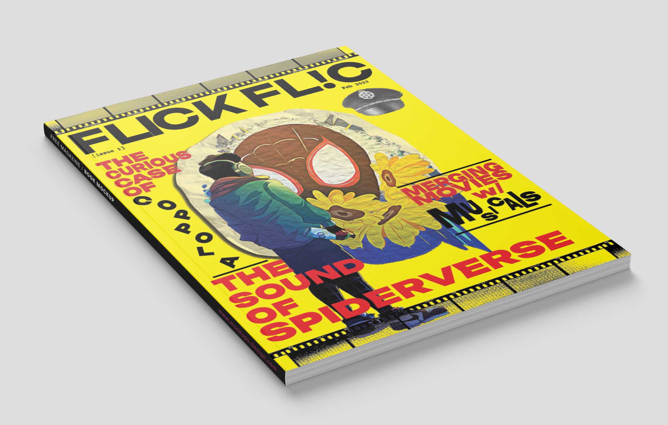
With the intent on making a movie magazine, I wanted to make a cover that isn't as cluttered and celebrity driven like most movie magazines. The approach then became using typography to tell a story within the front page.
Solution
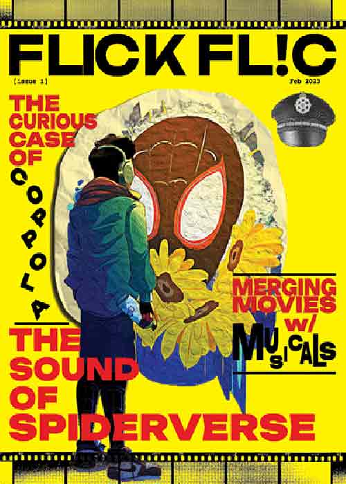
Since the cover can't be devoid of a public figure, we used Elie's (another designer involved in the project) topic on the Spiderverse Movie. To keep in line with the AdBusters inspired theme and title, we used the grafiti that Miles Morales spraypaints in the film as vadalism on the cover.
The typography remains playful and whimsical both in it's composition and phrasing to entice the reader to find out what "The Curious Case of Coppola" really is.