About
I chose to create a zine for my personal print project because I like how it can incorporate traditional art and digital art. Since I have a love for comics, my goal was to combine fun typography with my illustrative style.

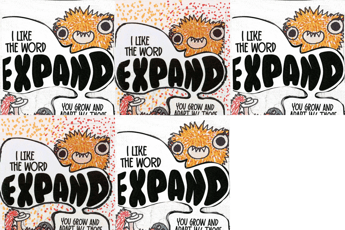
This assignment required us to create a print project based on our interests in design.
I chose to create a zine for my personal print project because I like how it can incorporate traditional art and digital art. Since I have a love for comics, my goal was to combine fun typography with my illustrative style.
To start, I chose to follow the folding pattern for an 8pg zine using an 8.5 by 11 piece of paper. In regards to topic, I tested out different things like music, comics and commentary. I then landed on illustrating a conversation between a friend because my other ideas weren't as accessible to anyone who might read it.
I finally chose the topic about growth because I figured readers would be able to relate to the zine's interpretation of growth. In previous tries, I went for realism which made the zine seem a bit corny. At least for me. I opted for using these Bigfoot esque creatures because the story comes off more endearing. Or at least I hope.
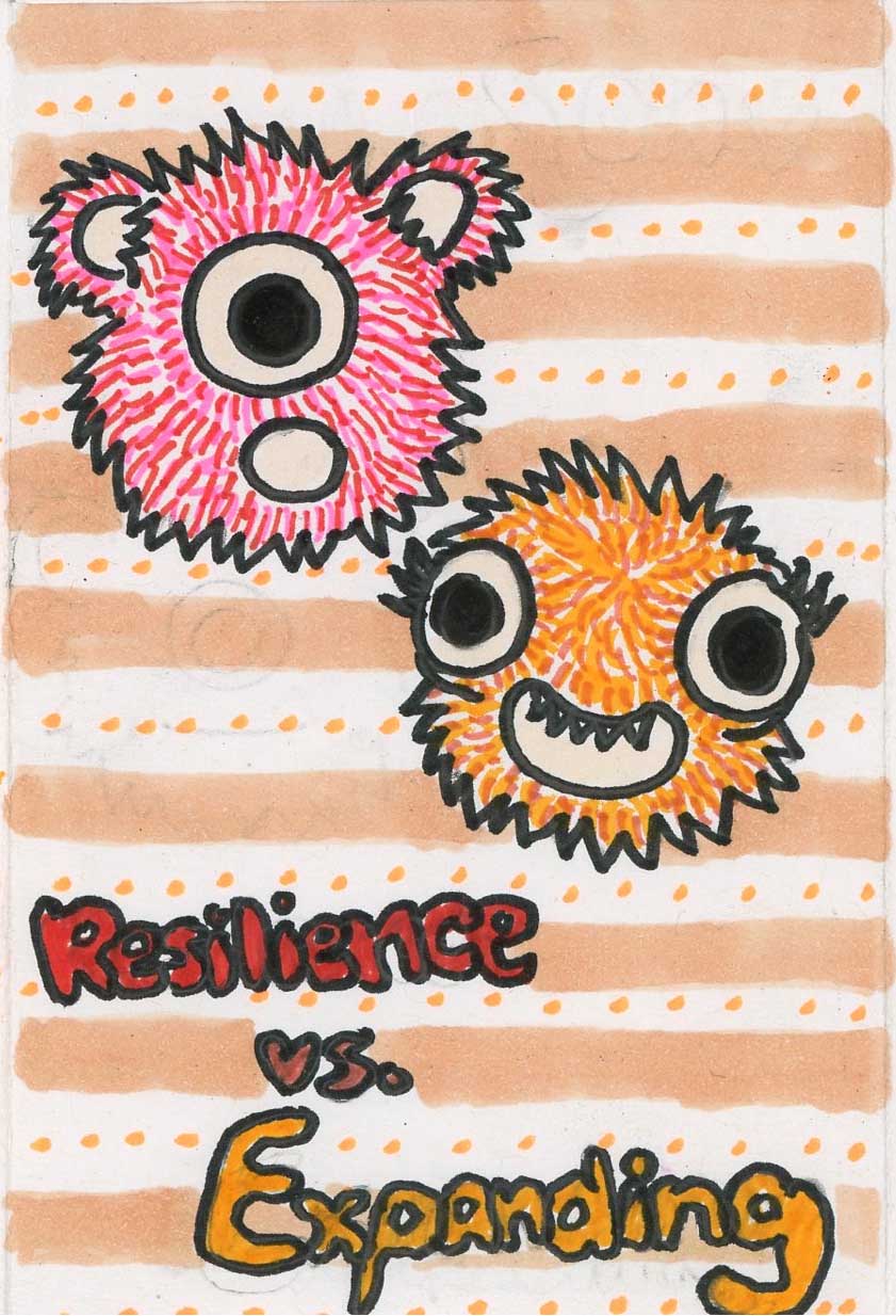
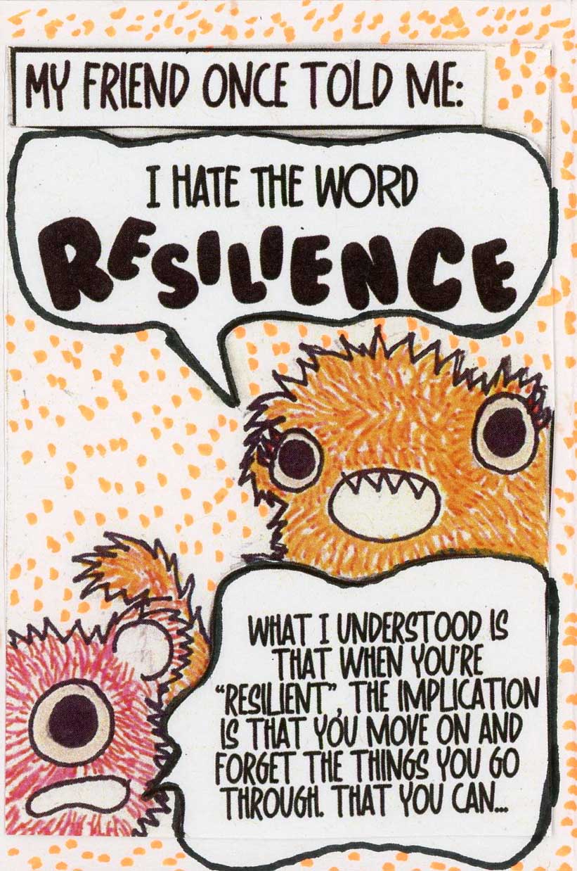
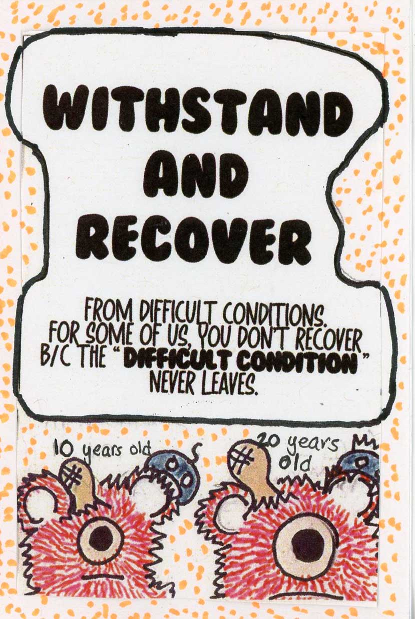
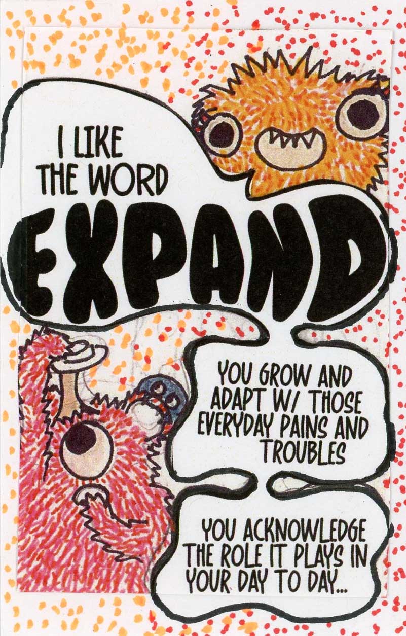
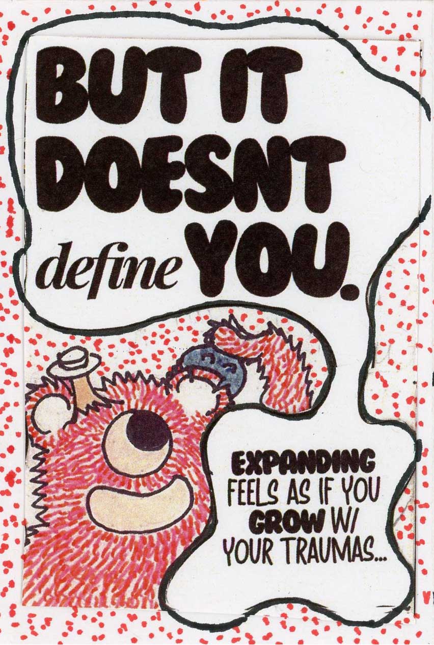
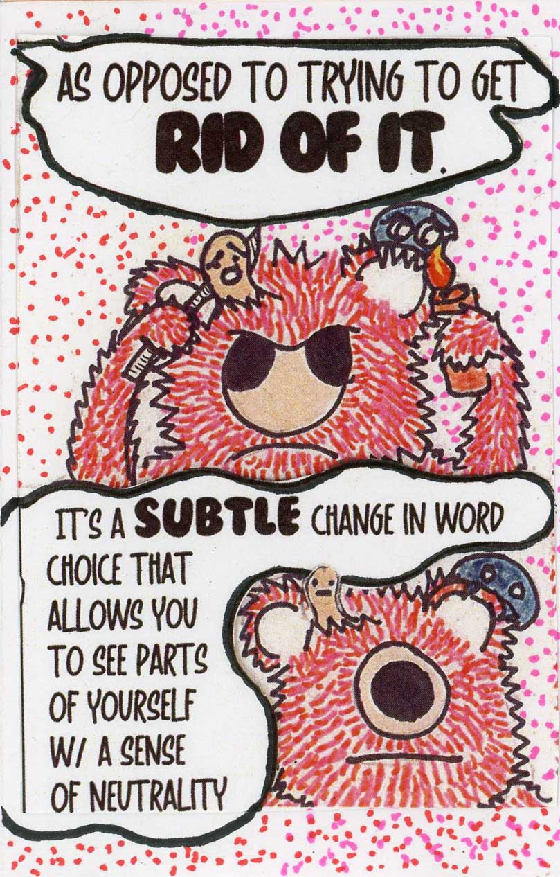
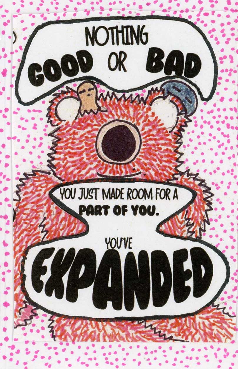
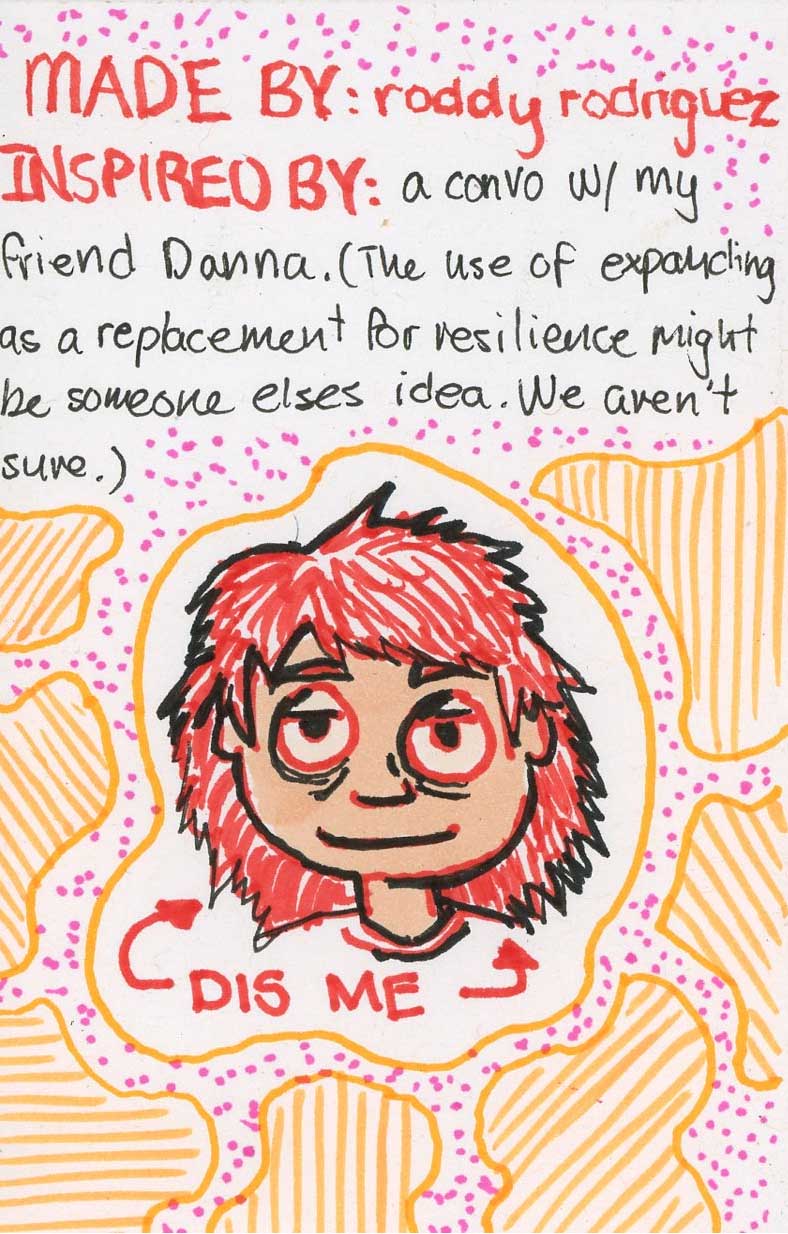
The zine turned out beautifully! The font, colors, and style got better and better the more I got to the photocopying stage of the zine process. Although I was tempted to write and color the text myself, the crude mix of glued on printed vector graphics and messy pen and ink is clearly better.